
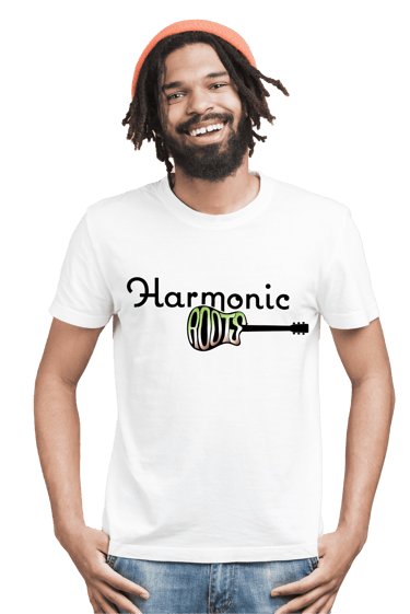
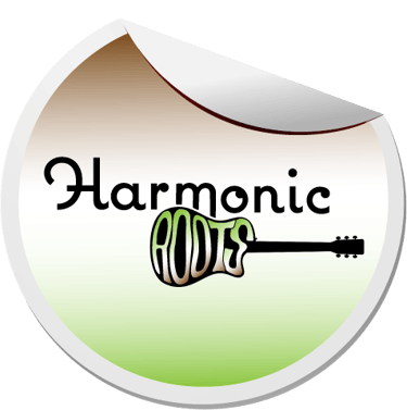
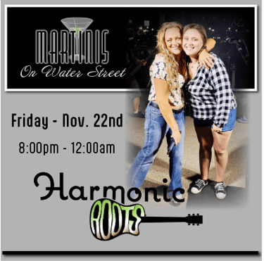
Logo Design
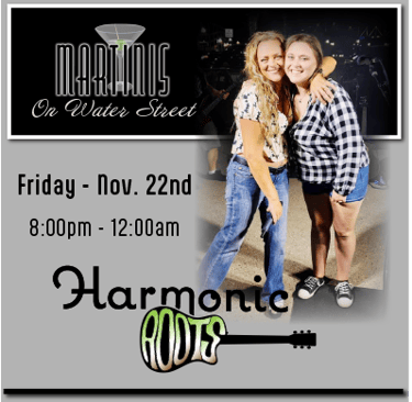
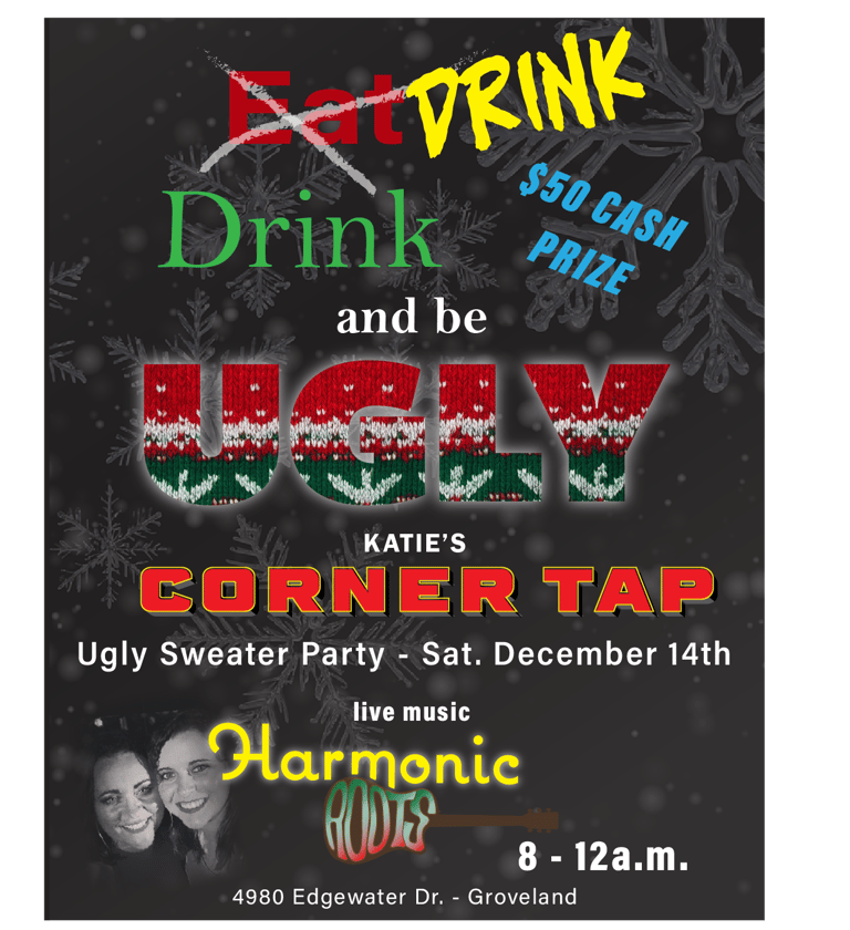
Harmonic Roots
Acoustic Duo
Harmonic Roots is a mother/daughter acoustic duo. They perform locally in the central Illinois area. This family has been involved in the Illinois music scene for well over 20 years. The ladies understand that updating their many projects are a crucial component to staying fresh and relevant in the music scene.
The Challenge
To stay relevant, the duo needs to re-brand to attract a new audience of followers in order to gain future bookings at new venues.
The Target Audience
New and existing fans ages 25 - 55 years old.
Design Process
The target audience are drawn to a more vintage music festival feel such as Woodstock or 1960s & 1970s design esthetics.
The "Harmonic" typeface has a more contemporary feel with clean lines and curves.
The "Roots" typeface gives a more vintage feel from a time when most branding was hand drawn with it's less than perfect bubbled, and curvy shapes.
The color palette of black, lime green, and brown gives the logo power but also peaceful harmony.


Innovative design solutions for your branding needs.
Contact
depewtiful1@gmail.com
Phone: 309-241-4651
© 2025. All rights reserved.
*text or email for quicker response