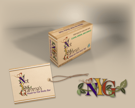
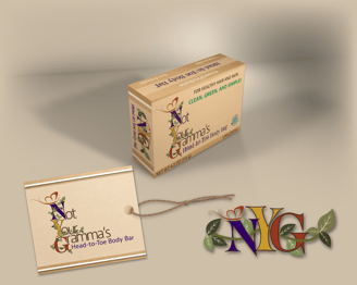
Brand Identity
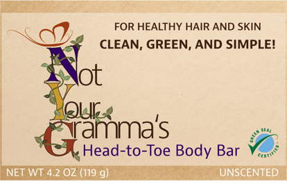
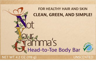
Not Your Grammas Head-to-Toe Body Bar
Eco-friendly Body Bar
Not Your Gramma's is a new organic cleaning and body care line that utilizes sustainable packaging and organic ingredients. Infused with ethically sourced fragrances from around the world, Not Your Gramma's lathers and cleanses to reveal skin and hair that is soft, smooth, and lightly scented.
The Problem
Not Your Gramma's needed help developing a logo and brand identity that would appeal to a younger generation of consumers that value sustainable practices and natural, organic ingredients.
Target Audience
Mid to upper class males and females of all ethnicity ages 18-35 years old that strive to shop organic products that use sustainable packaging.
The Design Process
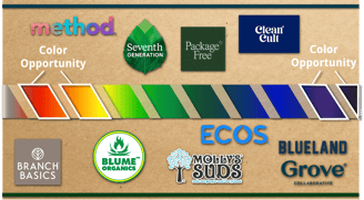
I chose the color palette of purple, gold, and red because these colors represent luxury, warmth, and youth. A competitive analysis revealed that these colors are utilized the least in this market so packaging will stand out among competitors on the shelf.
With a male and female target audience in mind, I designed a logo and brand identity that I feel will be attractive to all.
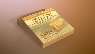
The use of plain, brown recyclable paper as a backdrop for the logo and word mark adds a nice, neutral palette for the logo imagery to live and makes a statement about the company's commitment to using sustainable packaging.
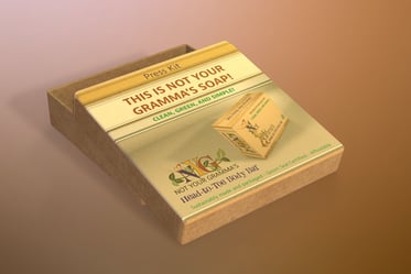


Press Kit Packaging
Competitive Color Analysis
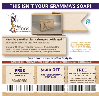
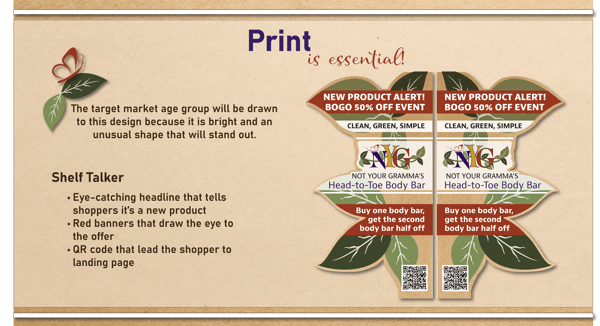
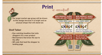
Print Ad/Coupons
Print Ad/Magazine with QR Call-to-Action
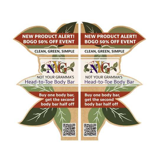
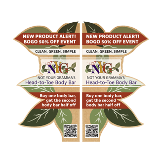
Print Shelf Talker
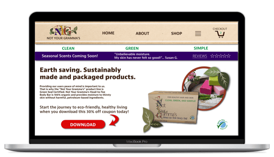
Landing Page Desktop with Call-to-Action
Landing Page Mobile with Call-to-Action
Soap Box Design
Front
Side
Top
Brainstorming
Innovative design solutions for your branding needs.
Contact
depewtiful1@gmail.com
Phone: 309-241-4651
© 2025. All rights reserved.
*text or email for quicker response